The Crown Display Font for Bold Digital Identity
As a UI designer who ships dozens of landing pages, SaaS dashboards, and e-commerce experiences each year, I don’t reach for display fonts lightly. They need to earn their place—not just look striking in a mockup, but hold up across devices, support clear visual hierarchy, and reinforce brand tone without sacrificing usability. The Crown is one of the few modern display fonts that consistently delivers on all three.
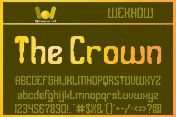
Visually, The Crown balances confident geometry with subtle organic rhythm. Its uppercase-heavy structure features clean terminals, open counters, and carefully tuned letter spacing—making it legible even at smaller sizes than most display typefaces allow. It’s not a script or handwritten font, nor does it lean into retro or grunge aesthetics. Instead, it reads as contemporary, self-assured, and quietly versatile: think editorial magazine masthead meets premium app branding.
In practice, I use The Crown where impact and intention matter most: hero section headlines, product name tags, course title banners, and logo lockups for digital-first brands. On a coaching website, it transforms “Clarity Framework” from generic to memorable. In an online boutique, it gives product categories like “Limited Edition” or “Studio Collection” instant distinction. For a game studio’s launch page, it anchors the headline while letting UI elements breathe—no competing visual noise.
Readability isn’t automatic with display fonts—but The Crown handles real-world web constraints well. At 48px+ on desktop, it’s commanding yet balanced. At 32px on mobile, it remains scannable if line height is set to 1.25–1.3 and letter spacing stays at 0–0.5px (never negative). I avoid using it below 24px—even bold weights lose clarity in body or button contexts. That said, it works beautifully as a decorative accent: a single word in a testimonial banner, a chapter title in a digital course, or a tagline overlaid on a muted background image.
Visual hierarchy is where The Crown shines. Because it carries strong typographic weight, it naturally pulls attention upward in the layout flow—ideal for guiding users toward primary CTAs or key value propositions. Pair it with a neutral sans serif like Inter, Manrope, or IBM Plex Sans for body copy and interface labels. This pairing creates contrast without tension: The Crown sets the tone; the sans serif ensures comprehension. For more editorial or luxury-facing sites, I’ve successfully paired it with a restrained serif like Literata or Crimson Pro—especially when the brand voice leans thoughtful or craft-oriented.
It’s not a system font, and it shouldn’t be treated as one. The Crown is best deployed deliberately: one weight (usually Bold or ExtraBold), one size range per context, and always with purpose. I never use it for navigation menus, form fields, or paragraph text—and rarely for full sentences longer than six words. Its strength lies in distillation: turning a brand promise, product name, or campaign idea into something instantly recognizable and tonally precise.
For responsive layouts, I serve The Crown via modern webfont formats (.woff2) with font-display: swap. This ensures fast loading while preserving layout stability. Most licensed versions include OpenType features like stylistic alternates and ligatures—useful for fine-tuning logo variants or special headers—but I keep those turned off by default unless a specific design calls for them. Multilingual support covers Latin-1 and extended Latin characters, which covers 95% of English, Spanish, French, German, and Portuguese web projects. If you’re building for Turkish, Romanian, or Vietnamese audiences, verify glyph coverage before committing.
Licensing is non-negotiable. The Crown is a premium font, and its commercial license explicitly permits use on live websites, client landing pages, SaaS platforms, online stores, and digital templates—as long as you’re not redistributing the font files themselves. I always confirm the license includes web embedding (not just desktop use) and covers the number of domains or monthly pageviews your project requires. For agencies, this means tracking usage across client sites; for solopreneurs, it means choosing the right tier upfront rather than upgrading mid-launch.
In portfolio sites, The Crown helps creative professionals signal confidence without cliché. A photographer’s site using The Crown for “Studio” and “Projects” feels curated—not cold. A UX consultant’s homepage with “Human-Centered Strategy” in The Crown reads as grounded and authoritative. Even in dark-mode interfaces, it holds presence: I pair it with a light gray (#e0e0e0) or soft white (#f8f8f8) on charcoal backgrounds, avoiding pure white to reduce glare.
Where it doesn’t work? Don’t force it into dense content sections, pricing tables, or data dashboards. Avoid stacking it with other high-contrast display fonts—it’s a lead actor, not ensemble cast material. And skip it entirely if your brand voice is playful, whimsical, or highly technical: The Crown conveys composure, not curiosity or complexity.
Finally, consider how The Crown supports consistency across touchpoints. Once you lock in its use for your main headline style, it becomes part of your brand’s visual grammar—reinforced in social media banners, email headers, and digital ad creatives. That cohesion builds recognition faster than any single visual element. It’s not about making everything “look the same.” It’s about making every screen feel unmistakably *yours*.
- Use The Crown for hero titles, logo text, and short branded phrases—not body copy or UI labels
- Pair with a highly legible sans serif (e.g., Inter, Manrope) for all functional text
- Test readability on mobile at 32px with generous line height and minimal tracking
- Verify webfont licensing covers your domain count and traffic volume
- Apply it selectively: one weight, one context, maximum impact